Smart Responsive Menu
- Last Update
- 10 August 2013
- Regular License
- $6
- Extended License
- $30
- Sales
- 61
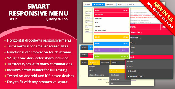
Plugin Information Smart Responsive Menu is powerful dropdown menu solution that will work with mobile devices and different screen sizes. Menu relies on CSS media queries to modify menu display for different resolutions. By default, plugin changes paddings and font sizes for screen resolution higher than 480px. For less than 480px, menu changes from horizontal navigation into vertical and gets hidden behind the menu item. Due to the many differences between mobile browsers, different support for CSS, menu must use JavaScript to make up for these problems. There is no way to make menu universally work without use of JavaScript.
Plugin is tested with all available Android browsers (Android 2.3.5, 4.0 and 4.1), iPhone and iPad Safari and Chrome (iOS 6), all modern desktop browsers. It requires JavaScript and jQuery support to work.
Powerful styling and customization options
Plugin allows using any color (built in, or custom created styles), includes the effects to add shadows, borders, animations, support font icons and much more. JavaScript object includes few more enhancements.
Easy to use builder to test effects and colors
Page with the style and effects builder allows you to see how each effect looks like with different built in color styles. You will get the partial HTML markup you can use for your project. Plugin comes with different demos.
Support for mobile devices and small screens
Menus are fully responsive, and they will work fine on the small screens (mobile/touch devices) and will turn from horizontal to vertical for easier navigation with a limited space. It is tested with Android and iOS based devices and browsers.
Powerful integration and code customization methods
Plugin control is done by combining CSS classes on the menu element with many options available with the jQuery plugin. Plugin also has functions to generate styles plugin can use from custom colors.
Included Color Styles Each of the color schemes included are available with light and dark background. Colors available: gray, blue, red, gold, green and blue. Styling Effects You can combine different effects to display the menu:
Gradient: with three different gradient styles Rounded: with one class for the rounded display Box Shadow: with one class for the shadow Text Shadow: with two classes for different shadows Transitions: with five different transition effects Menu Links: with three types of characters and arrows Sub-menus Width: with two classes to change width of menus
Other Features
Various demos and examples to show how menu can be set Style builder for testing each of the styles and effects Full source files for both CSS and jQuery Minimized CSS and JS files with split and merged styles
Changelog Version 1.5 / 2013.08.10.
Added: Vertical menu open/close animation Added: Option to add extra classes to element Updated: Demo files and examples Fixed: Several issues with the demos
Version 1.3 / 2013.04.06.
Added: jQuery plugin option for responsive screen width Updated: BlackBerry 10 devices strings added to JavaScript code Updated: Izilla touchMenuHover jQuery plugin v1.6 Changed: Few improvements to the core CSS styles Changed: Further expanded PDF documentation Fixed: Text shadow effect missing for toggle state Fixed: Box-shadow effect for menu toggle state Fixed: Submenu width effect causing problem for toggle state
Full changelog available on plugins home page