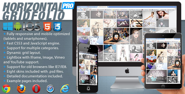
Horizontal Gridfolio Pro
- Last Update
- 3 July 2013
- Regular License
- $12
- Extended License
- $60
- Sales
- 91
What is Horizontal Gridfolio Pro?
Horizontal Gridfolio Pro is a fully responsive media grid plugin that allows you to display media content with an unique and original layout. It’s perfect for presentations, for anyone that want to obtain a great impact on their visitors.
Horizontal Gridfolio Pro features a large variety of options, it can have any number of categories and each category can have any number of images. When a thumbnail is pressed you can choose either to display an original media lightbox which we have coded, no action or open a webpage. The lightbox can display images, iframe (html pages) and videos loaded from YouTube or Vimeo.
Horizontal Gridfolio Pro is mobile optimized running great on iOS (iPad, iPhone), Android and Windows8 mobile devices and of course it works on every modern browser and older browsers like IE7 and IE8. We have tested it on IPAD3 and on a SAMSUNG GALAXY S3 and it runs great on both devices.
Horizontal Gridfolio Pro can be used in any type of HTML page including Wordpress, at this link there is a demo page running in Wordpress (Please note that this is NOT a Wordpress plugin!, the grid must be installed manually with html code and the images uploaded with a ftp client, we have inclulded a tutorial about how to install it in Wordpress.
We have also included full documentation, examples pages and PSD files along with eight skins.
Grid main features.
Responsive / Flexible / Fluid layout: the grid can be used with three display types, responsive/fixed, fluid width or fullscreen. Autoscale: The grid can resize it’s height proportional to the width this way on smaller screens it will keep a correct ratio and it will be completely visible (optional). Drag or Scroll Function: The grid can be dragged with the mouse/finger or scrolled like a regular HTML page. Mouse wheel support: The grid can be scrolled with the mouse wheel (optional). Support for any number of categories and each category can have any number of images, if it has only one category the categories selector is disabled/not visible. Customizable thumbnail’s size and geometry: this feature allows you to change the thumbnials size, border size, corner radius and the space between them. Customizable thumbnail’s border and background: each thumbnail can have a border and a background, the thumbnail’s background color,border size and the border color are customizable, also the thumbnail’s border color can be animated from a normal color to a selected color. Thumbnail’s description or thumbnail’s media icons: each thumb can have a short description with a transparent background under it or a media icon which represents a link, iframe, video or image, this are visible when the mouse is over a thumbnail, the text can be formatted with CSS, the background color and opacity also can be modified (optional). The thumbnails can be also static, this means that nothing will happen when the mouse is over them or they are clicked/touched. “More thumbs feature”: this is an awesome feature which improves the overall performance and speed of loading because in this way not all the thumbnails are loaded and displayed at once. For example if you have a total of 120 thumbnails you can show them in sets of 50 thumbnails, and so initially in the grid the first set of 50 thumbnails are loaded and displayed, and when the “More thumbs” button is pressed the next set of 50 thumbnails are loaded and displayed, and finally when the “More thumbs” button is pressed again the 20 remaining thumbnails are showed. The number of thumbnails to load per set is customizable, it does not have to be 50 it can be any number that you consider. This feature is optional, if it is disabled all thumbnails are loaded and displayed. Custom press thumbnail action: when a thumbnail is pressed you can choose either to display an original media lightbox which we have coded, or to open a new webpage, the url and target of this webpage can be specified. The lightbox can display images, iframe (html pages) or videos loaded from YouTube or Vimeo. Also the grid can be set when a thumbnail is pressed to do nothing, this way it can be used as a simple image wall.
Lightbox main features.
Responsive / Flexible / Fluid layout: the lighbox will always fill the available browser viewport. The entire color theme can be modified. Vimeo and YouTube support: all you have to do is to include the link from YouTube or Vimeo video that you want to display and the lighbox will display and play your video. The size (width and height) of each video can be set easily. Video autoplay: When a video is displayed it can be set to autoplay (this feature is not work on mobile because the operating system is not allowing it). Iframe support: The lightbox can display HTML pages, all you have to do is to include the link of your page that you want to display. The size (width and height) of each iframe (html page) can be set easily. Image support: The lightbox can load and display .jpg, .jepg and .png files. Zoom and panning support for images: The images can be zoomed in and out or paned, this way you can see the image in great detail (optional). Slideshow button (optional). Slideshow autoplay. Slideshow delay: The slideshow delay can be set in seconds. Slideshow custom animated graphics. Next and previous buttons navigation (optional). Info button and info window: Each lighbox item can have a description, the text and window appearance can be formatted with CSS (optional). Customizable border and background: The border size and color and also the main background color are customizable. Keyboard support: The left and right arrows can be used for navigation (optional).
