Responsive Images Generator & Loader
- Last Update
- 30 June 2013
- Regular License
- $14
- Extended License
- $70
- Sales
- 82
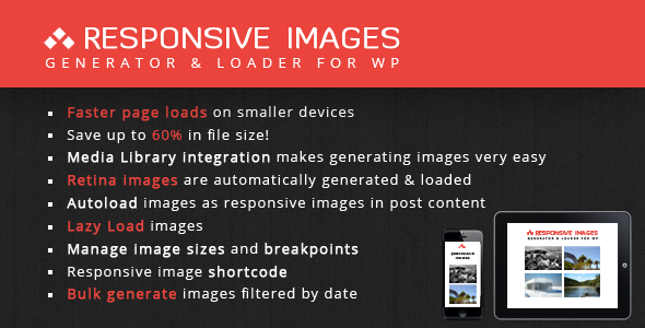
Improve the page speed of your WordPress website
Responsive images for WordPress out of the box. Lazy loading and high quality images for Retina displays. This is the must have plugin for any responsive website.
By using RIGL you will save approximately 35% in file size for each image on tablets and 60%! on smartphones.
Why we need responsive images. Please read this article if you are not convinced of the need for responsive images.
This plugin will generate and load smaller images for devices with a smaller screen width. By using lazy load the images won’t be loaded untill they enter the screen of the visitor. These techniques will make your website much faster and saves you a lot of bandwidth.
Latest update: 1.0.3.3 – (July 1, 2013)
Easy to Use
Works out of the box for all new uploads Optimal default settings are automatically loaded on activation Images placed inside the content of all post types are automatically made responsive
Media library integration makes it very easy to generate smaller images for already uploaded images
Features
Retina images are automatically generated and loaded RIGL will load images to best fit the screen width and the pixel ratio of the viewing device Supports a responsive image shortcode to make images outside the post content responsive Easily manage image sizes and breakpoints
Bulk generate images and delete generated images filtered by date
Media Library integration
See for each image which smaller versions are available/missing Generate per image size, per image or select a bulk of images to generate images for using Ajax (without a page reload) Select images which should be ignored, which no images should be generated for when bulk generating images
Bulk Generate or Delete Generated Images inside the Media Library Truly faster To illustrate your website will truly become faster take a look at this calculation. You have an page with 20 images that each have the same dimensions 1024×768 and they are the same size 120kB.
20×120kB = 2400kB. For a tablet images with dimensions of 800×600 are loaded, they are 78kB each. 20×78kB = 1560kB -> 2400 – 1560 = You save 840kB For a smartphone images with dimensions of 600×450 are loaded, they are 48kB each. 20×48kB = 960kB -> 2400 – 960 = You save 1440kB
Bulk Generate By Date
Generate images for all images (using Ajax) Select uploaded images by date and generate images in smaller bunches
Managing Image Sizes & Breakpoints Made Easy
Add as many image sizes and breakpoints as you wish Image sizes will automatically be added to the WordPress uploader Temporarily turn off an image size or breakpoint Set the maximum width + height and the crop type (soft proportional/hard) for individual image sizes at each breakpoint
High Quality Code
Loads fallback images when JavaScript is not present Uses the full version of the images if no smaller versions have been generated yet Ajax powered admin pages Well documented
Requirements & Support
WordPress 3.4+ PHP5+
If you are not rating this item with 5 stars, please tell me what you are missing. I want to do all I can to let you get the most out of RIGL. You can find a detailed help file here. If for some reason this is not sufficient, feel free to contact me on my ThemeForest profile if you need additional help.
Changelog
Version 1.0.3.3 - 01-07-2013
- Added option to choose between fluid and fixed images. Rigl-stylesheet is updated accordingly depending on selected option. This makes full screen responsive images possible. - Implemented ordering for image sizes & breakpoints. - Fixed issue with scripts from theme Kallyas. - Removed meta charset declaration from markup when replacing images for responsive ones. - Dequeue unwanted styles on RIGL options page when Kallyas theme is used. - Added presets to import tab. For now there are two presets: fixed en fluid images. - Changed styling for admin panel.
Version 1.0.3.2 - 29-05-2013
- Added 'no-lazy' class to be used by images which should be ignoring for lazy loading. - Load Lazy load javascript images after gravatars javascript.
Version 1.0.3.1 - 19-05-2013
- Added auto replacement for Lazy Loading in combination with non-RIGL images. - Fixed replacement bug of special characters for auto replacement of images for lazy load. - Fixed conflict Lazy Load plugin and alignment classes of WP. - Added option to set compression value for images.
Version 1.0.3 - 17-05-2013
- Fixed replacement bug of special characters for auto replacement of images.
Version 1.0.2 - 15-05-2013
- Fixed unwanted deletion of other plugin/theme/WP generated images when an RIGL generated image with same dimensions was deleted. - Added landscape icons for use in media-library column headers. - Fixed class name for breakpoints which did not replace spaces. - Fixed file update notifier script which could be in conflict with other plugins that use this script.
version 1.0.1 - 11-05-2013
- Added Lazy Loading of images + tab on settings page. - Added option to make featured images auto responsive. - Removed option “Turn off WP sizes” and replaced it with new tab “Ignored sizes” on settings page. Also, WP sizes are now not ignored by default. - Auto replace images in the post content without a RIGL size set is now turned off by default. - Added import/export tab on settings page. - Images with dimensions of exactly the highest set max-width or max-height weren’t saved in the database, this is fixed now. - Cleaner markup for the srcset attribute of the responsive images. - Added missing tooltips to icons in row header in media library. - You now can add this class for images you do not want to be responsive inside the post content: “rigl-ignore”. - Added filters for loading default settings (to be used by theme authors). - Improved feedback for generate images page.
version 1.0 - 07.05.2013
- Initial release.