Responsive Layout
- Last Update
- 22 July 2013
- Regular License
- $4
- Extended License
- $20
- Sales
- 56
Responsive Layout
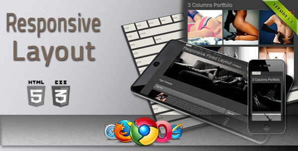
This is a responsive layout implemented by HTML5 & CSS3. It can be used in websites or admin panels. This is highly compatible for displaying on smart devices. This layout is based on percentage widths, you can set fixed layout or fluid layout very easily.
Features:
Responsive layout 12 columns layout Offseting for move columns – v1.5 (updated july 2013) Resizable images 2 columns sample 3 columns sample 4 columns sample 6 columns sample Portfolio sample page Fluid page sample Fixed page sample User guide
Compatible Browsers:
IE7-9 Firefox Chrome Opera Safari Tested on (320×480)-(1928×1012) resolutions
If you have any further questions about this layout, please feel free to send me an email. I’d be glad to help. If you like, please rate it !
- NEW FEATURE: Offseting for move columns - july 2013
I have added new feature in my layout. Its name is “OFFSET”, easier to use columns. If you want to move columns across the row, should set offset*.
