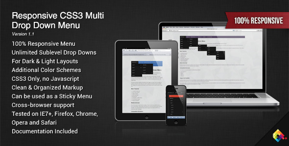
Responsive CSS3 Multi Drop Down Menu
- Last Update
- 28 March 2013
- Regular License
- $4
- Extended License
- $20
- Sales
- 161
Designed and coded to fit into any layout, this menu is made to create unlimited drop downs in a clean and easy way. If viewed on a touch device, the drop downs will work like accordions that can be opened and closed.
The whole menu system is based exclusively on CSS3 and doesn’t use javascript at all. It can be included anywhere on your pages or used as a sticky top bar (fixed version).
You can choose between a “light” or a “dark” version according to the color scheme of your site and the package includes some additional colors.
Main Features
Completely responsive Infinite Submenus Can be fixed to the top of the browser Dark & Light Themes Additional Colors No Javascript Valid XHTML / CSS3 markup Cross Browser Support Help documentation
Compatible Browsers
This menu has been tested (and works !) in all the following browsers :
Internet Explorer 7+ Firefox 3.5+ Safari 4+ Opera 10+ Chrome 4+
Changelog
03/28/2013 – Version 1.1
Added Media Queries in the CSS for a better mobile support Separated IE7/IE8 CSS as they don’t support Media Queries
02/20/2013 – Version 1.0
Initial Release
Before buying
If you browse my portfolio, you’ll find several types of menus. They all offer slightly different options so I encourage you to take the time to carefully read the descriptions, test the previews and additionnally read the comparison at the bottom of my profile page.
I’ve also created a website that compares and filters my different menus by options / features, Mega-Menu.com. If you’re still not sure about the menu that would fit into your project, you can contact me at any time from my profile page.
