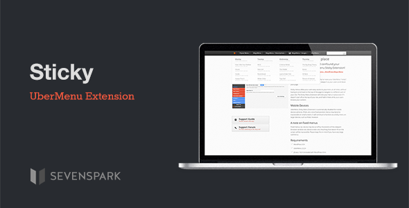
UberMenu - Sticky Menu Extension
- Last Update
- 10 July 2013
- Regular License
- $4
- Sales
- 1682
This plugin is an extension for UberMenu – WordPress Mega Menu Plugin
UberMenu Sticky Extension adds the ability to make your UberMenu “sticky”, meaning it’ll stick to the same spot in the viewport as your users scroll down your page.
Sticky menus allow your users easy access to your menu at all times, without having to scroll back to the top of the page to navigate to a different part of your site. The Sticky Menu Extension will stick your menu in place even if it doesn’t start off at the top of your site, and hold it there while your users browse your content.
Please note that as this is an extension, it will not do anything without UberMenu installed.
Mobile Devices – Important Notes
By default, UberMenu Sticky Menu Extension is automatically disabled for mobile devices (phones, iPods, etc), since overflow content on fixed position menus will become inaccessible on small screens. It will continue to function as a sticky menu on larger devices, such as iPads, however.
Update v 1.2 – As several customers have requested the ability to override this feature, in version 1.2 I have added an option in the Control Panel to enable sticky functionalty on mobile devices for advanced users. However, since support for overflow touch scrolling is still less than perfect on mobile devices, this feature is considered experimental and not officially supported – that is, if this setting does not work as expected on your site, the only solution will be to disable it. Please be aware of this when purchasing, thanks!
A note on fixed menus
Fixed menus, by nature, may be cut off by the extents of the viewport (browser window size, device screen, etc). Anything that doesn’t fit on the screen will be inaccessible. Please keep this in mind if you have very large submenus.
Requirements
WordPress 3.5+
UberMenu 2.3+ (with jQuery Enhancements enabled) jQuery 1.8.2+ (included with WordPress 3.5+)
UberMenu not included; must be purchased separately.
A Note on CSS Positioning
Because the positioning is fixed (that’s what allows it to stay in the same place on the screen), the ways in which you can position your menu are more limited, as fixed elements are taken out of the flow. Out of the box, UberMenu Sticky allows you to create a sticky menu that expands the full width of your window, or aligned left within your content width (dependent partially on your theme structure). More advanced positioning is unpredictable because of the inconsistent way various browsers handle fixed positioning. Right-aligned-within-the-content-area positions, for example, are not possible out-of-the-box. Please be aware that custom positioning beyond the basics is the customer’s responsibility.
Credits
jQuery WayPoints
Changelog
v1.2 July 10, 2013
* Added option to disable CSS * Added Scroll Context, so sticky can work within scrollable elements * Added experimental sticky mobile option with overflow touch scrolling * Added permanent sticky capability * Updated WayPoints version
v1.1.1 February 22, 2013
* Improved compatibility with themes that adjust the menu positioning
v1.1 January 28, 2013
* Updated to use jQuery WayPoints for more efficient scrolling event handling
