Mobile CSS Pro
- Last Update
- 6 November 2012
- Regular License
- $17
- Extended License
- $85
- Sales
- 12
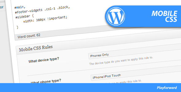
This plugin allows you to define different CSS rules that get loaded into the page’s for specific devices.
This can be useful if you need to target specific phones or tablets to make CSS changes or show certain advertisements for certain devices.
Allows you to narrows CSS style rules down to
- 18 different tablet options - 13 different phone options - 14 different operating system options - 15 different browser options
Also allows you to adjust the viewport scale and if the viewport is scalable.
