Responsive HTML5/CSS3 Layout
- Last Update
- 9 November 2012
- Regular License
- $4
- Extended License
- $20
- Sales
- 137
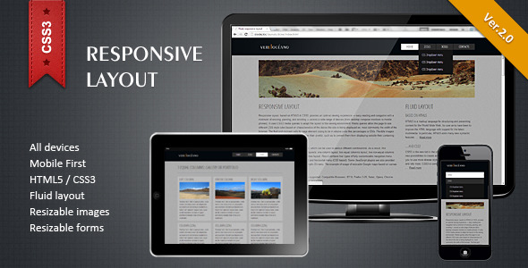
This fluid, responsive layout, based on HTML5 & CSS3 , provides an optimal viewing experience across a wide range of devices: from desktop computers to mobile phones and tablets. It uses CSS3 to adapt the layout to the viewing environment.
Video preview
Features:
Fluid layout (100% or 80% width, or you can set any other width you want); This pack includes 4 pages with basic design and different layout examples: one column, two equal columns, two non-equal columns (main column plus sidebar), three columns. You can use them in any combination; Two CSS3 based navigation bars: horizontal dropdown and vertical accordeon; Resizable images; Resizable form; Resizable Google maps; Clean and well-commented HTML and CSS code.
Absolutely responsive: tested on different devices with different screen resolutions.
Tested browsers: IE7 -9, Firefox 3-15, Safari, Opera, Chrome; Tested screen resolutions: from 320×240 to 1920×1080.
Please feel free to contact me if you have any questions or suggestions Latest Update: v2.0 (09.11.2012)
Fix: Responsive behavior for IE7 -8;
Improvement/Fix: Navigation panels changes & fixes;
Improvement: General performance (HTML & CSS optimization).