HTML5 Slideshow Gallery Thumbnails XML
- Last Update
- 30 August 2013
- Regular License
- $16
- Extended License
- $80
- Sales
- 85
Version 1.1 Release Date 30.08.2013
Fixed various bugs and added the unminified version of js files.
What is HTML5 Slideshow Gallery Thumbnails XML?
The HTML5 Slideshow Gallery Thumbnails XML is size flexible or fluid, it will adapt it’s size (width and height) based on the parent container (div or some other html tag) and every piece of the gallery will align and position accordingly, this basically mean that it can be used in any kind of website, it dose not matter if you need a small or large gallery, all you have to do is to add the gallery in a place which you have chosen in your website and the gallery will adapt. Also if you like you can instantiate the gallery to fit the browser’s viewport regardless of the screen resolution.
This gallery is using the GPU (hardware acceleration), the rendering speed and performance is impeccable on desktop computers and most importantly on mobile devices.
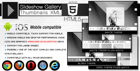
The HTML5 Slideshow Gallery Thumbnails XML comes in with 3 different embed styles: Fixed Dimensions, Full Width and Full Screen. Please check the lives previews of this gallery and convince yourself of its quality, the complete instructions about how to setup this embed styles are included in the help file.
Amazing performance on mobile devices, you can see in the video demo that it runs just like a native app!, it was coded and optimized for mobile devices and it is 100% mobile compatible and of course it will run just as great on PC. We have tested it on IPAD3 and it runs great, you will interact with it as you would with a native app, you can see a video demo at this link
This HTML5 Slideshow Gallery Thumbnails XML plugin can be embedded in WordPress and you will receive, along with the download files, the complete instructions in the help file. WordPress demo available here
Features:
Fully XML driven this makes it really easy to install and maintain.
Unique and original way of displaying the images, thumbs and large images.
Unique and original thumbs navigation.
Optimized for mobile, you can actually drag and swipe the images just like you would on a native mobile app (touch screen navigation support for mobile), we insist to watch again a video demo at this link
Size flexible or fluid layout!
Support for multiple instances in the same page: you may have as many galleries as you want in the same page and each one of the galleries / instances has its unique set of images and settings. You can have as many galleries as you wish.
The entire color theme and graphics skin can be modified the buttons are actually images (.png or .jpg) so you can replace them with your own graphics, the button graphics can be have a different shape, basically the look of this gallery can be completely modified. The black theme skin and white theme skin are included in the download files.
The background color can be modified or it can be left transparent.
Full screen button (optional).
Bulk image preloader, it’s a feature for fast loading and displaying the photos, the images are loading in the background.
The thumb can have any format or size (landscape or protrait), also they can be positioned top or bottom.
Autohide buttons, you can set the gallery to autohide the buttons after a number of seconds of inactivity, the delay in seconds can be set (optional).
Slide show button, (optional).
Slide show delay, can be specified in seconds.
Slide show autoplay option.
Then color theme for the slide show preloader and images preloader can be modified.
Support any type of image format, (landscape, portrait or whatever)!
Next and previous buttons to navigate between thumbs, as mentioned above the graphics for this buttons can be modified.
Next and previous buttons to navigate between images, as mentioned above the graphics for this buttons can be modified (optional).
Zoom in and zoom out buttons (maximize / minimize) for the big images this buttons allow to maximize the image and pann it with the mouse on desktop and finger on mobile, this feature can be really useful! (optional).
Keyboard support you can navigate between the large images or thumbs with the right and left key for the large images and up and down key for the thumbs and start or stop the slideshow with the space key.
Navigation help screens (optional).
Info button and info window for each image, each image can have a info/description window, this window can be styled with css, it has full css support (optional). The image description/info window is also flexible / fluid, this mean that it will resize to always fit the screen, it dose not matter what device is used or the screen resolution, the text will always be visible, if there is too much text on pc a scrollbar will appear and on mobile the text can be scrolled with the finger.
Many other cool features …
