Degrade - The Swiss Army Slider
- Last Update
- 27 July 2012
- Regular License
- $8
- Extended License
- $40
- Sales
- 142
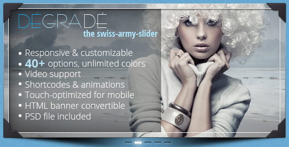
Degrade – The Responsive Multipurpose Slider Degrade – the swiss-army-slider is a multipurpose, fully customizable slider, with responsive behavior and all-in-one features. It sports a 40+ options variation, the slider‘s appearance can be customized through its 8 different shadows, 4 different corner style, 6 different control types, unlimited colors, shortcodes, captions style, fullscreen behavior, giving you the possibility of making literally hundreds of different sliders.
The slider can be also used as a banner, can play video, can display captions wherever you want, can be used as advertising tool as well as display panel. Make the best of it!
Features:
Design variation Easily change its look and feel within seconds. Degrade Slider comes with lots of prebuilt assets like shadows, corners, controls. Unlimited colors, you can easily change every component’s color inside the slider making it unique. Alternatively you can disable any design component and create HTML banners that run across all devices.
Performance All slides are being dynamically loaded trough Ajax, we paid special attention to its performance while keeping its rich design, slides are available as soon as they are loaded, there are no memory leaks, Degrade Slider is also optimized for touch/drag screen events.
Shortcodes Degrade Slider comes with builtin shortcodes. Shortcodes makes it easy to add different elements that you might need inside the slider. For example you need a red button with rounded corners, you simply add the following code within a caption:
<a href="http://yourlink.com" class="degradeButton roundButton red">Button</a>
See all available shortcodes within the preview. Responsive Whether you‘re displaying on desktops, tablet, mobiles, your work, your images, your products will always look the same!
PSD and Help files Degrade Slider comes with layered PSD and all the design elements (shadows, arrows, buttons and corners). See help files here: ReadMe
Slider options
slideAnimationType: "easeOutQuint", //slider's animation/transition type slideAnimationDuration: 600, //slides default animation duration enableTouchDragSlides: true, //enable/disable touch and drag slides autoPlay: false, //autoplay slides autoPlayInterval: 5000, //autoplay interval (5 seconds) pauseAutoplayOnHover: true, //pause autoplay on hover autoPlayStopAtEnd: true, //stop autoplay at the end (could be used for banner creation) autoScale: true, //responsive behavior showShadow: true, //show slider shadow shadowType: 'ShadowType01', //shadow type (there are 8 shadow types available ShadowType01 ....to ...ShadowType08) showBottomCorners: true, //show bottom corners bottomCornersStyle: "CornerStyle01", //corners style (there are 4 corner types available CornerStyle01 ....to ...CornerStyle04) showCenterButtons: true, //show center navigation buttons showCenterButtonsBackground: false, //show center navigation button's background centerButtonsAdjustPosition: 20, //adjust center navigation buttons vertical position (ex: 20 or -20) showCenterButtonsStyle: "Style01", //center navigation button's style (there are two style available Style01 and Style02) enableKeyboardNav: true, //enable/disable keyboard navigation showSliderBackground: true, //enable/disable sliders's background sliderBackgroundColor: "#FFFFFF", //sliders's background color sliderBackgroundOpacity: .2, //sliders's background opacity sliderShowBorder: true, //enable/disable sliders's border sliderBorderColor: "#FFFFFF", //sliders's border color sliderShowInnerBorder: true, //enable/disable sliders's inner border sliderInnerBorderColor: "#FFFFFF", //sliders's inner border color showLeftRightNav: true, //enable/disable sliders's arrows navigation showLeftRightNavIsBackground: false, //sliders's arrows navigation background leftRightNavBackgroundColor: "#212121", //sliders's arrows navigation background color leftRightNavType: "Nav04", //sliders's arrows navigation type (there are 4 types available: Nav01 to Nav04) leftNavAdjustPosition: 10, //adjust horizontal position of left navigation arrow rightNavAdjustPosition: -10, //adjust horizontal position of right navigation arrow showSliderPreloader: true, //enable/disable slider's preloader showDragCursor: false, //show drag cursor enableFullScreen: true, //enable/disable native full screen (for browsers that supports full screen) normalWidth: 800, //default slider width normalHeight: 400 //default slider height
Captions Degrade Slider supports unlimited captions on each slide, you can add any HTML content within captions.
Each caption has predefined properties and animations which you can override from within HTML. See available properties below.
positionX:"0", //caption position X positionY:"0", //caption position Y animation:"None", //caption's animation cpuld be (None, SlideFromLeft, SlideFromRight, SlideFromTop, SlideFromBottom) animationType:"easeOutQuint", //animation transition type (see NOTE above) animationDuration: 500, //animation duration (see NOTE above) delayAnimation:0, //delay animation start (see NOTE above) isBackground: "false" //caption background backgroundColor: "#212121", //caption background color backgrondTransparency: .5, //caption background transparency fullWidthVideo: "false" //caption full width video (see sample with video)
Other Features
Full-screen support Touch optimized jQuery Powered Unlimited color variation Custom Design PSD Source Included Documentation Included
Credits Preview Images (Fotolia.com). Please note that the preview images are not included within the download file.
Images included within the download file (Publicdomainpictures.net).
Social Media Balloon Icon Set by (Double-J Design).