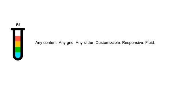
Ether Grid Slider jQuery Plugin
- Last Update
- 10 August 2013
- Regular License
- $6
- Extended License
- $30
- Sales
- 175
Ether Grid Slider is an extremally functional jQuery plugin designed for transforming any type of content into practical grids and/or sliders. You can use it with any type of mixed content types such as images, videos, services, testimonials, featured stories or blog feeds to name a few. There are many thoroughly documented predefined examples you can base your configurations on. It comes with multitude of options and can be used as a base for consistent powering of sliders and grids across the entire application. A good and successful example of such application is our Ether Content Builder plugin for WordPress that takes advantage of all the options Ether Grid Slider offers.
Problems / Need help? DON’T USE CodeCanyon Comments for support requests as that’s not what they’re designed for. This will make our lifes easier. Thank you in advance! Follow Support Guidelines to get in touch with us for faster turnaround.
Latest Update August 6, 2013, version 1.4.0
Fixed: Responsiveness of slider navigation Added: Customizable nav prev/next arrows and pagination position and styles (arrows spanning full width are now available also) Added: Option to disable scroll on mousewheel Addded: Light / Dark theme compatibility Fixed: External links pointing to specific slides Fixed: Revised documentation and more descriptive and novice user friendly examples
Key Highlights
40 options Mousewheel support Touch/swipe support for mobile devices Many custom configured elements on single page Fluid & responsive layout Smart autoplay Image gallery options External linking – control sliders from anywhere Custom transitions, sliding axes, and more Highly customizable slider navigation
NOTE: If you’ve purchased and are missing any features don’t hesitate to email us with a request. This plugin is actively developed and we will definitely consider adding new stuff to make it even more functional!
Options
align: Target element alignment
always_show_img_title: Keep image titles visible and expanded
autoplay_enable: Autoplay
autoplay_interval: Autoplay interval in seconds
autoplay_shift_dir: Autoplay direction
col_spacing_enable: Enable spacing to occur between grid cells. 0 is handy for seamless/spaceless grids of images.
col_spacing_size: Spacing that occurs between grid cells.
cols: Column count. Degrades on smaller screens. Degradation steps can be easily adjusted in css.
ctrl_always_visible: Slider controls visible at all times or on hover only
ctrl_arrows: Display navigation arrows.
ctrl_arrows_full_width: Spaces nav arrows as far apart from each other as possible
ctrl_arrows_pos_shift_x: Custom horizontal offset of slider arrows
ctrl_arrows_pos_shift_y: Custom vertical offset of slider arrows
ctrl_arrows_pos_x: Horizontal position of slider arrows
ctrl_arrows_pos_y: Vertical position of slider arrows
ctrl_arrows_spacing: Minimum spacing between arrows
ctrl_external: Define external elements that will be able to change slides. Number in slide_id will result in absolute link. ‘prev’ or ‘next’ will behave as navigation arrows
ctrl_padding: Minimum distance of nav controls from gridslider element borders
ctrl_pag: Display pagination
ctrl_pag_pos_shift_x: Custom horizontal offset of slider pag
ctrl_pag_pos_shift_y: Custom vertical offset of slider pag
ctrl_pag_pos_x: Horizontal position of slider pag
ctrl_pag_pos_y: Vertical position of slider pag
ctrl_pag_spacing: Minimum spacing between pagination items
ctrl_style: Style of navigation (for custom one provide path to filename)
easing: Transition effect for sliding animations
gallery_img_title: For image galleries. If an image tag has title or alt attribute defined (in this order), description will be displayed when an element is hovered
grid_height: Constrain forces sqare cells, numeric value forces fixed height. Especially handy for media galleries.
hide_grid_cell_overflow: Advanced: Useful when there’s a grid gallery of images with column spacing and images are higher than column content height (practically it means vertical margins seem to be half the size). This behaviour isn’t forced by default as in most cases galleries should not require it. This option set to false by default allows content (such as tooltips) within the column to overflow outside column borders and is generally less invasive
image_stretch_mode: Image stretch mode. Auto does not affect images. Other types are especially handy for image galleries.
img_title_pos_x: Horizontal position of image title (it’s always full width at the moment so it doesn’t have any pratcical effect)
img_title_pos_y: Vertical position of image title
loop: Behaviour of the slider on the last-to-first and first-to-last element transition
pause_autoplay_on_hover: Pauses autoplay when user mouse pointer hovers over the gridslider element
rows: Row count. Applies to sliders only.
scroll_axis: Scroll axis
scroll_on_mousewheel: Scroll slides with mousewheel when mouse is hovered over gridslider
scroll_speed: Scroll speed in miliseconds
scroll_transition: Scroll transition
slider: Transform element into a slider (0 will create a grid only)
theme: Defines element theme, default is light. ‘dark’
view_pos: Visible slide
width: Target element width
See detailed view of all options and their description.
Mission Main focus of this plugin is to facilitate creation of grids and sliders out of any content and being as little invasive on the code output as possible. Grid and slider functionality do not affect actual content behaviour. Thanks to that you can easily add a lightbox to a grid of images the same way you would without this plugin or have any other side functionality still in place when plugging in a gridslider to a specific element.
Image Gallery Options Simple list of images can be transformed in a few different ways. For example you can constrain width to height ratio of grid cells so that they’re always square, auto or custom fixed height. Images within grid cells can be also further manipulated by changing their container fill mode. You can see a couple of practical implementation examples on the slider demo page or by browsing the examples available inside the package upon download.
Support In case of any troubles use and abuse sources below as much as you need.
Email: contact.pordesign@gmail.com (please include your item purchase code along with the problem description) Forum
Update Log August 6, 2013, version 1.4.0
Fixed: Responsiveness of slider navigation Added: Customizable nav prev/next arrows and pagination position and styles (arrows spanning full width are now available also) Added: Option to disable scroll on mousewheel Addded: Light / Dark theme compatibility Fixed: External links pointing to specific slides Fixed: Revised documentation and more descriptive and novice user friendly examples
March 5, 2013, version 1.3.1
Fixed: Core fixes Added: scroll_on_mousewheel property Fixed: jQuery 2.0 compatibility
September 30, 2012, version 1.3
Fixed: Core fixes Fixed: IE7/8 compatibility Fixed: General tweaks and some structural changes
June 18, 2012, version 1.2
Fixed: Autoplay with navigation disabled Added: External controls now allow for linking to prev/next slides, too (only absolute linking was possible before) General tweaks and some structural changes
May 6, 2012, version 1.1
Added: Dynamic adding of new elements into existing gridsliders Added: External linking to specific slides Added: Automatic titles for images Added: Loop option Added: Easing effects for slide transitions Added: Mousewheel support Added: Swipe support for mobile devices More thorough and to the point documentation 10+ premade examples including: classic slider, clients slider, custom text content slider, dynamic slider, external linking, image feed, services slider, testimonials slider and more
3 Mar 2012, version
Added IE7 Support Added two new options â?? target element width and alignment