Little Boxes Responsive Grid
- Last Update
- 18 June 2012
- Regular License
- $5
- Extended License
- $25
- Sales
- 229
Item description
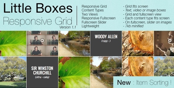
Little Boxes Responsive Grid is a jquery templating item that let you display your videos, images and articles on an expandable grid. On click on a thumb, it expands fullscreen with a nice width/height effect You can navigates through images via an included slider on fullscreen mode Both fullscreen and grid are responsive The idea comes from a codrops tutorial, which is extended in many ways (like videos support, and grid centering)
Main features
Responsive Grid – Grid fits screen
3 Content Types – Text, video or image boxes
2 Views – Grid and fullscreen view
Responsive Fullscreen – Each content type fits screen
Fullscreen Slider – On fullscreen, slider on images
Lightweight – 7kb minified